

Gimi
CLIENT: Gimi
LOCATION: Sydney
CATEGORY: Doing Good
SCOPE: Brand Identity, Brand World, Packaging, 3D Renders
SITE: Gimi
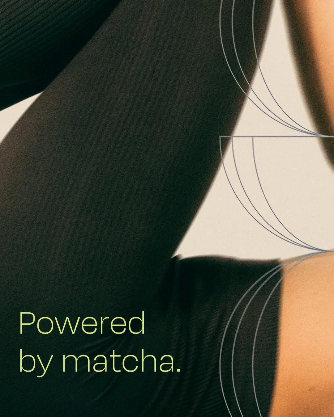
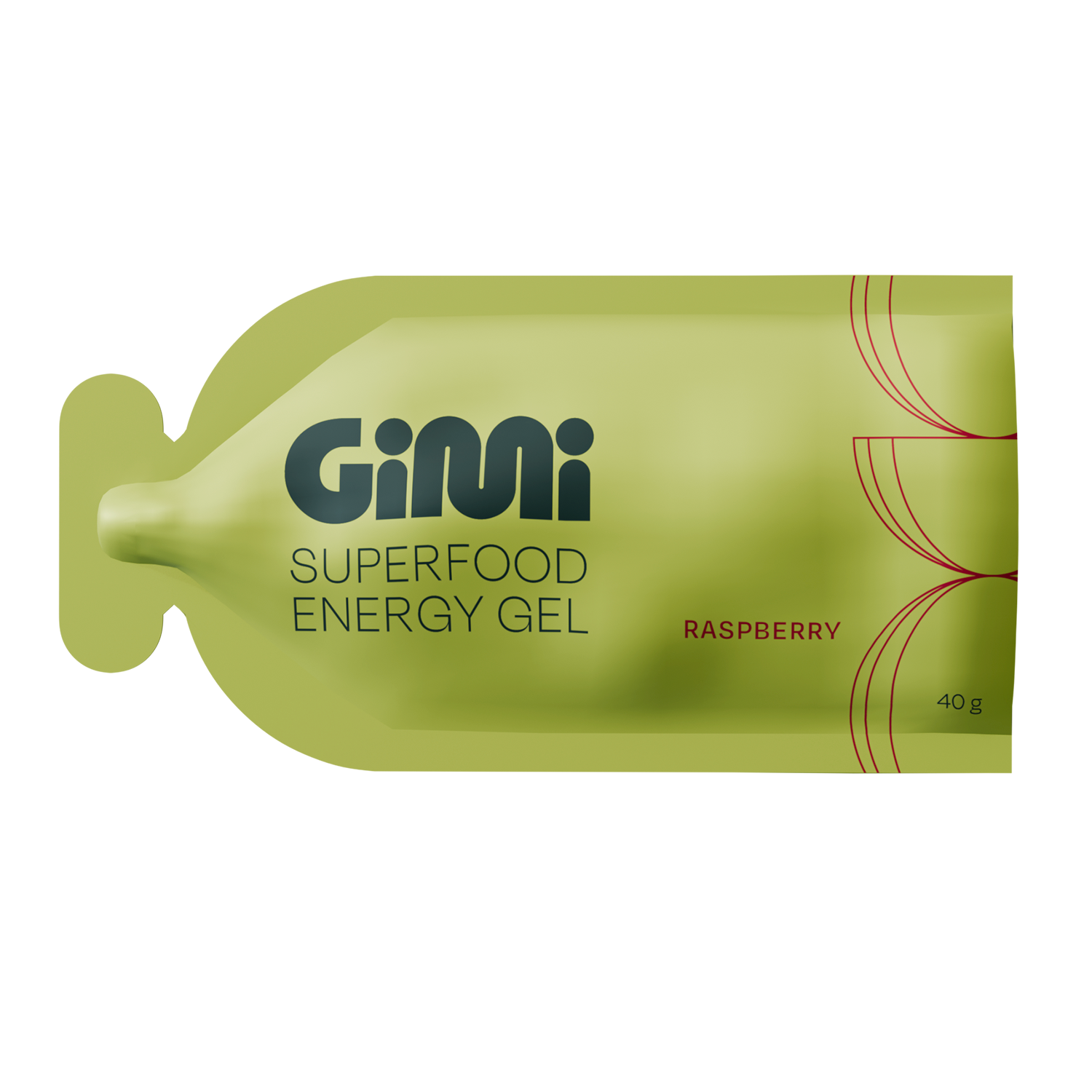
Gimi was created to be your go-to everyday energy gel that’s powered by matcha, with an ingredients list that’s actually good for your insides.
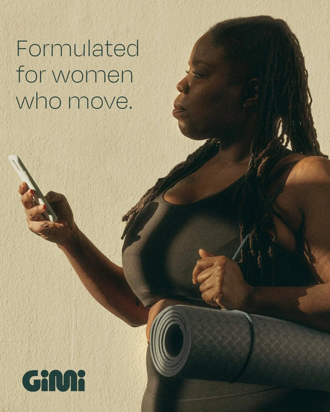
The energy gels are formulated for women who move, and were created to power your everyday: from your pilates sessions, to your Sunday morning walk, and all the chaos in between.
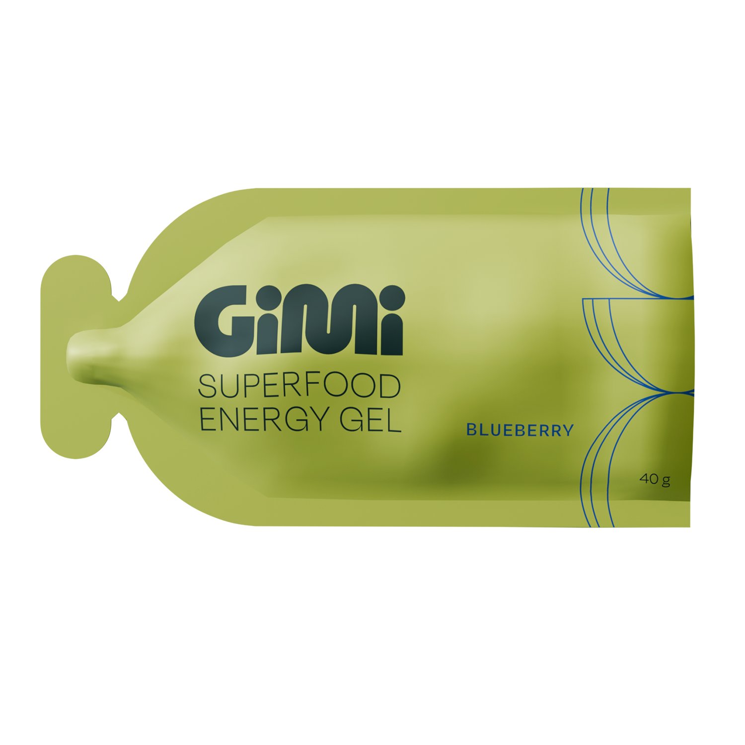
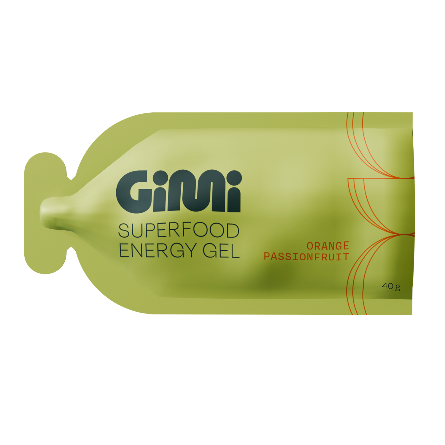
The identity and packaging I designed with the team was inspired by the pace and rhythm of everyday movement, with shapes that are just as bold as they are fluid, paired with a palette that’s rich in contrasting shades of green.
The goal was to allow Gimi to fit perfectly into your already busy life, so we kept the brand and packaging system simple, and as easy to navigate as possible.

How is this Doing Good?
If you’ve ever taken up a sport that requires continuous movement, it’s likely you’ve come across an energy gel, or energy bar in your time. And if you’ve ever flipped over to the back and read the ingredients label, you’ve probably noticed that they’re very often filled with a bunch of additives and ingredients that aren’t actually very good for you. That’s where Gimi stepped in: they’ve created an energy gel with an all-natural ingredients list.