

HAVING A YARN
CLIENT: Having A Yarn
LOCATION: Australia
CATEGORY: Doing good for people
SCOPE: Brand refresh
SITE: Having A Yarn
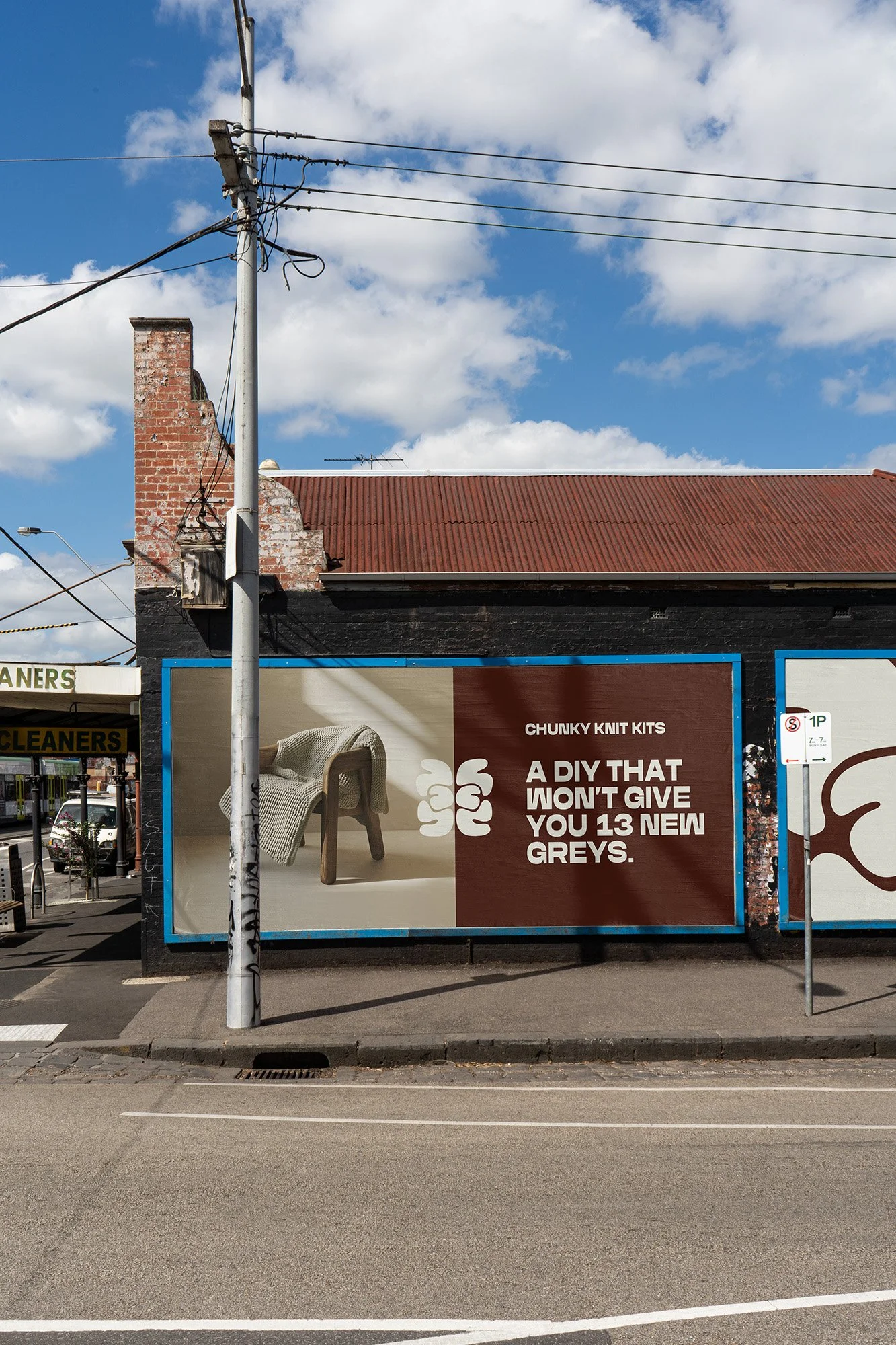
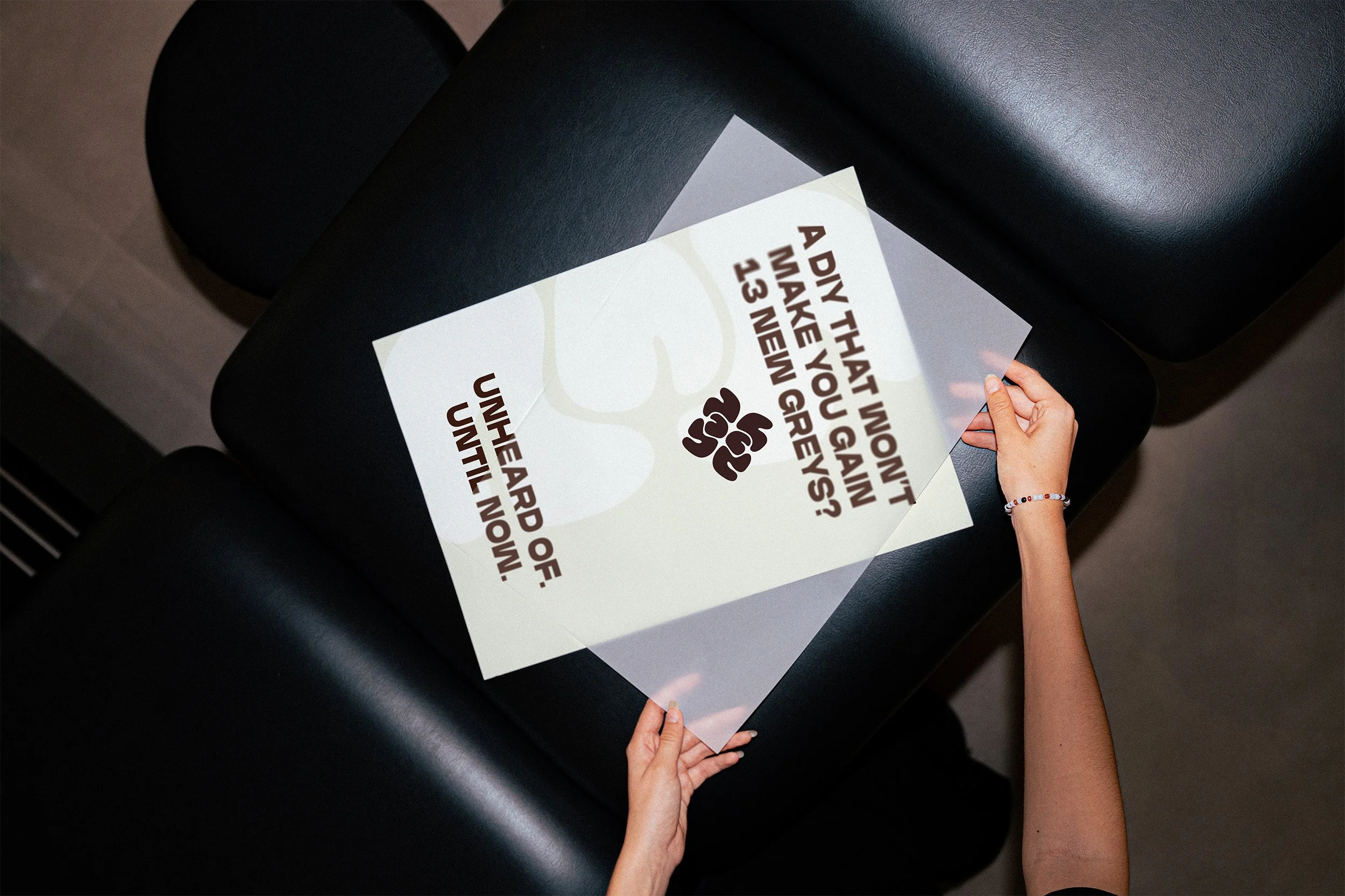
I worked with Having A Yarn to refresh their entire brand identity: retaining their original wordmark, but bringing in a stronger sense of visual calm. The goal was to create a space that encourages a calmer mind, and conscious moments offline between the scroll.
HAY are an ecommerce brand based here in AUS, on a mission to make knitting easy, accessible, and fun, whilst bringing together a like-minded community at the same time.
This 2.0 version of the brand needed to have an essence of mindful rituals and meditative practices, which became the thread that pulled this refreshed identity together.
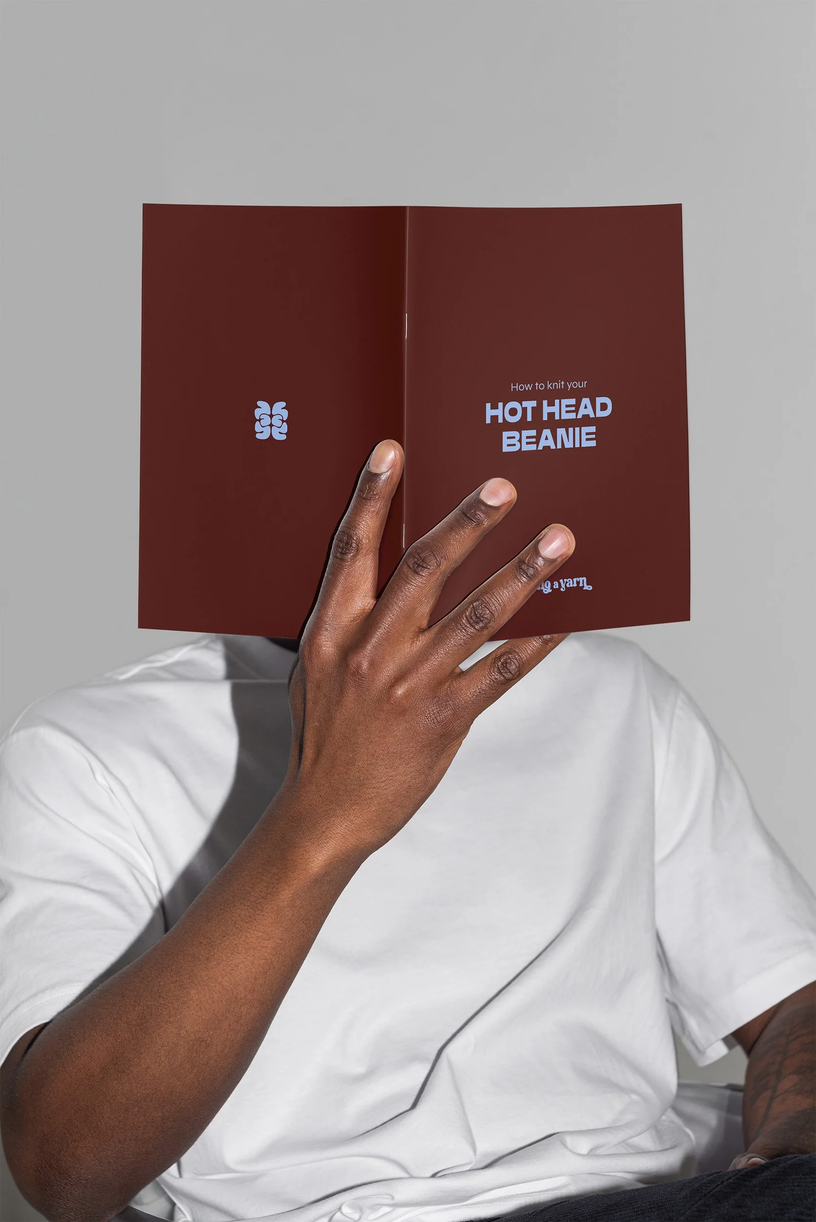
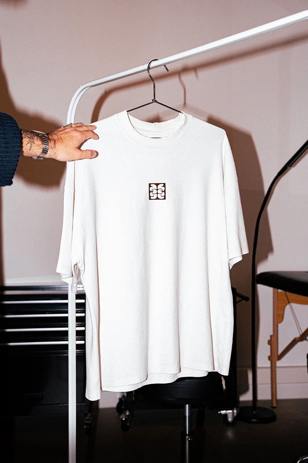
At the core of this project was a challenge to create a new mark which would work perfectly alongside the existing logo. The direction I brought to life was centred around the idea of symmetry, and inspired by the science of Rorschach tests.
If you look closely, you might notice this icon is created from the initials of the brand name itself, H-A-Y, and the kind of ‘if you know you know’ hidden meaning that brings the community even closer.
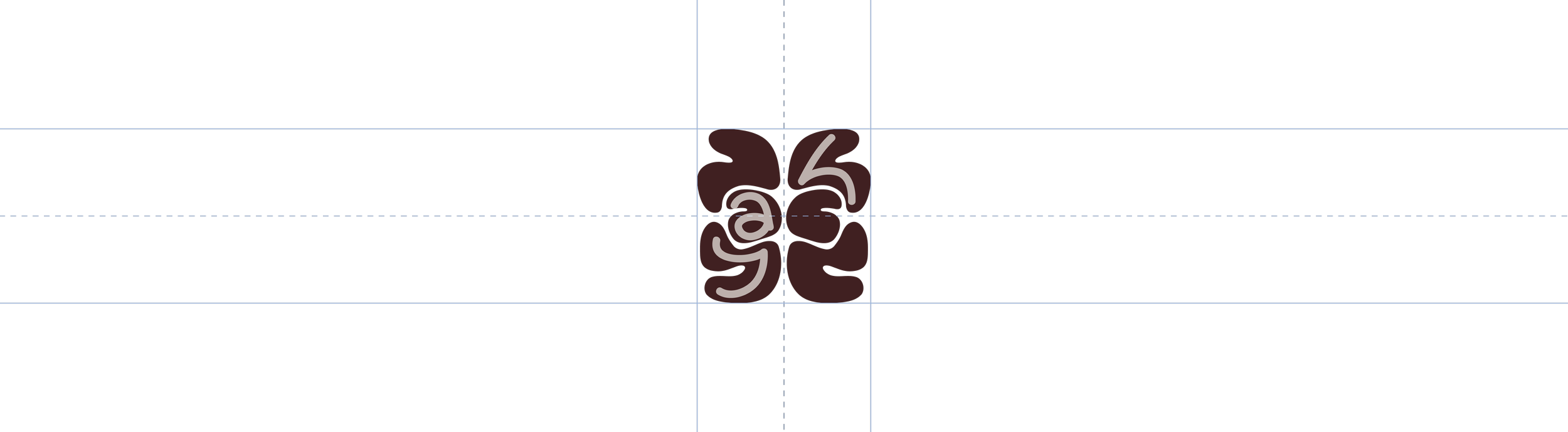


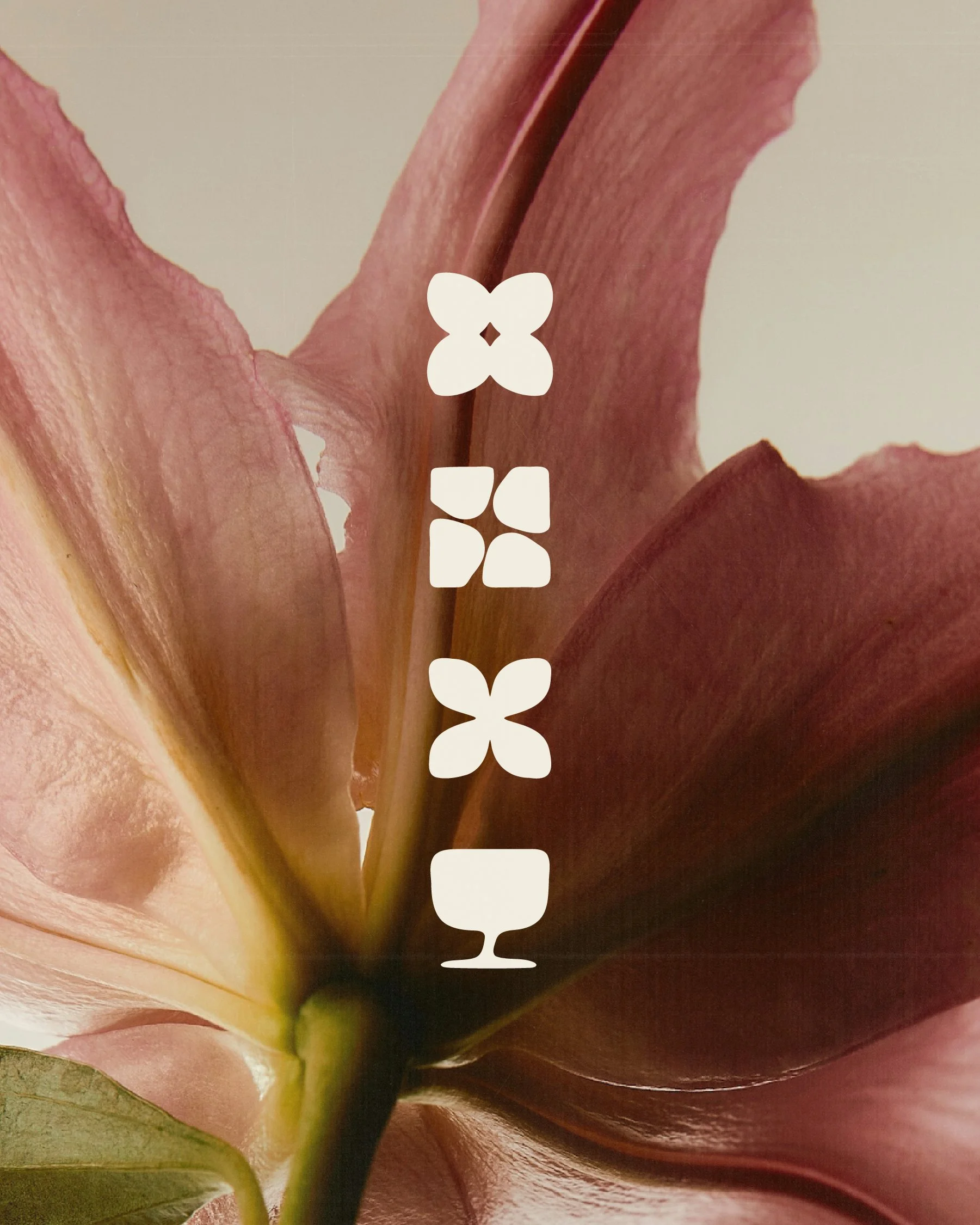

IN ORDER TO CREATE A SENSE OF VISUAL CALM, Symmetry became a core idea behind this brand refresh. IT was the guiding principle used to create the core brand icon, which we extended further into every area of the brand, from layouts to grid systems, icon styles and beyond.

How is this DOING GOOD?
Lauren is in business for the same reason she started it: to create a space for a hobby that’s fun, brings a community together, and eases the mind. Mental health is a huge driver behind the business, and one of the big underlying themes that helped bring this identity to life.