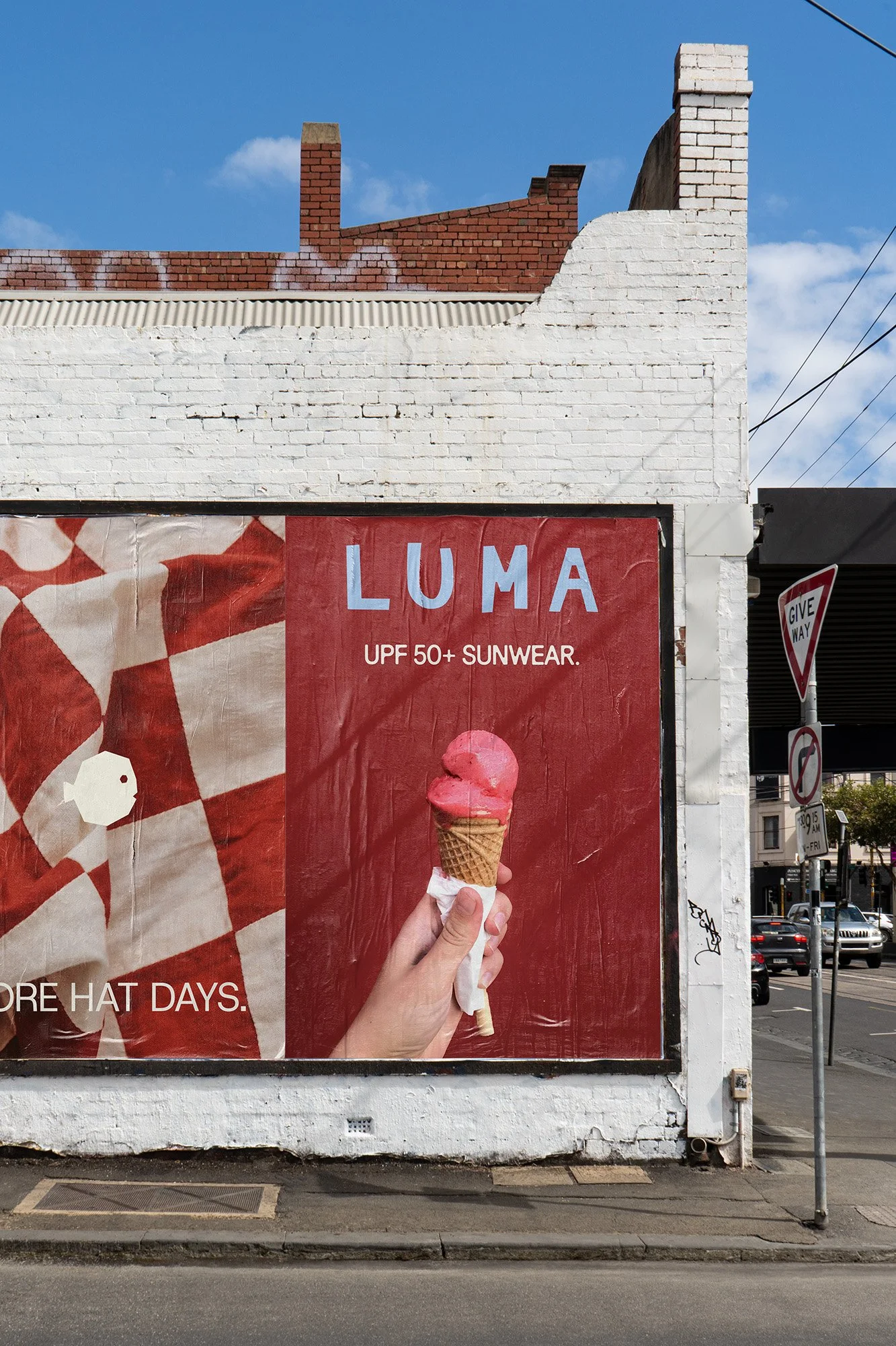
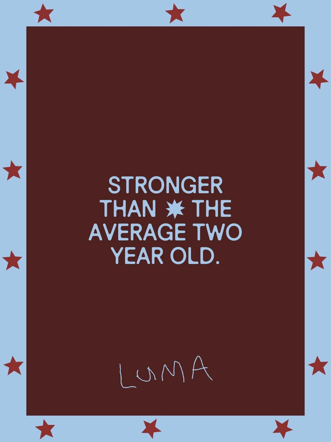
LUMA
CLIENT: Luma
LOCATION: Sydney
CATEGORY: Doing Good
SCOPE: Brand Identity, Brand World, Brand Collateral, Positioning, Brand Strategy, Key Messaging
YEAR: 2026
SITE: Luma
This is Luma: after a complete rebrand and repositioning, I helped the team revive their existing brand to bring it back to life, and to give it the brand world that it deserved.
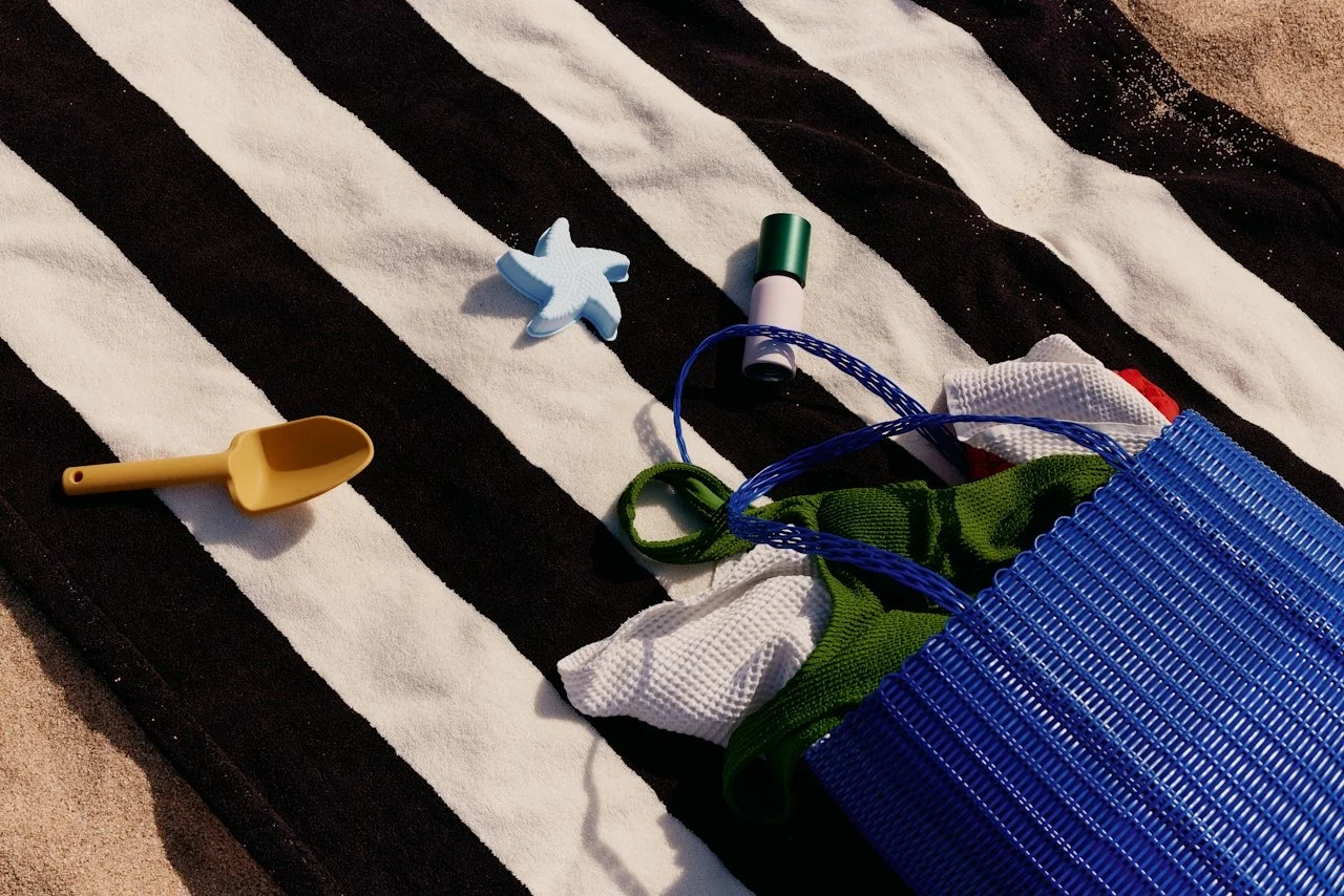
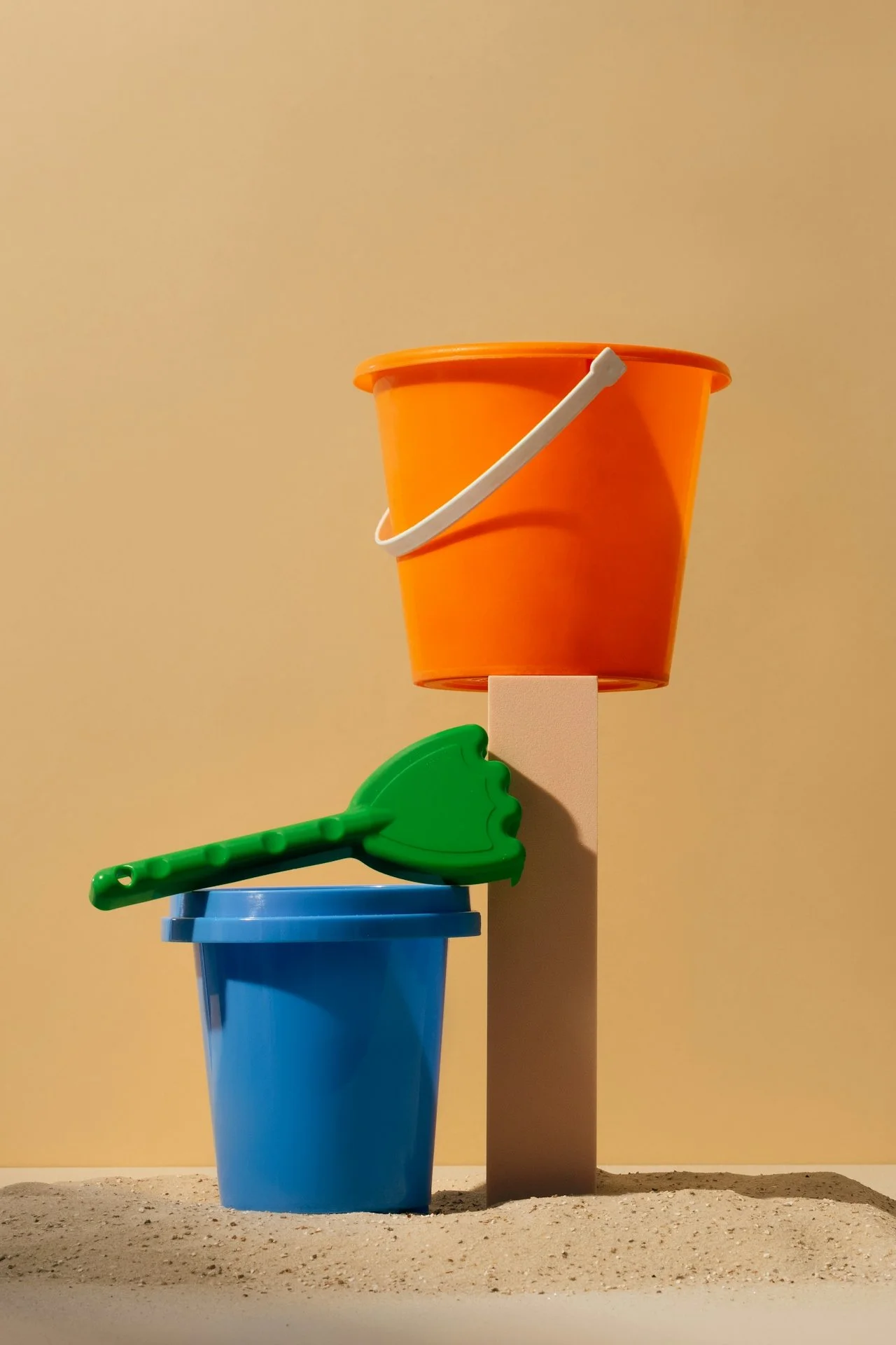
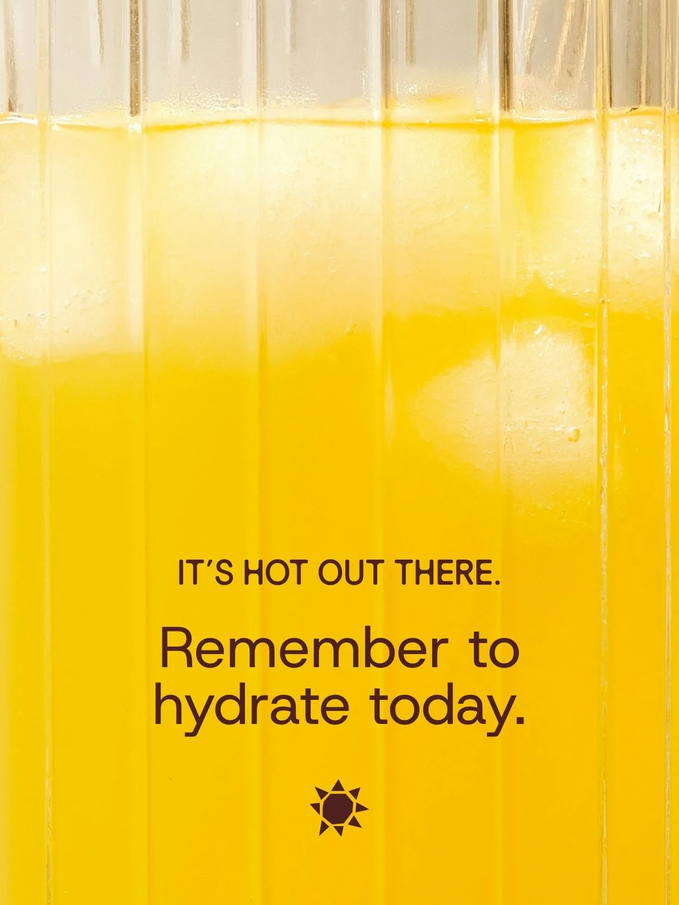
Luma is a kids sunwear brand based in Sydney, with their current core product being hats that have been designed with a buckle, so your little ones can’t take them off every five minutes. The Luma team came to me with such an incredible product, but were lacking a brand that told this story.
Our initial core focus for the project was the positioning, where I guided the team through a repositioning of the brand to where they now stand: as first and foremost a sun-safety brand, rather than an ecommerce brand. This small but mighty piece of strategy was the thread that helped tie the entire rebrand together, giving us a launchpad for a plethora of brand language and copy, as well as giving the team much more clarity around all other parts of the brand such as new product launches, brand collabs, all the way through to content pillars and website features.
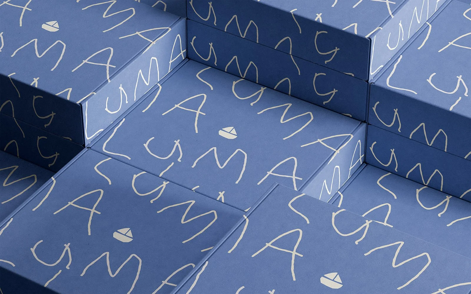
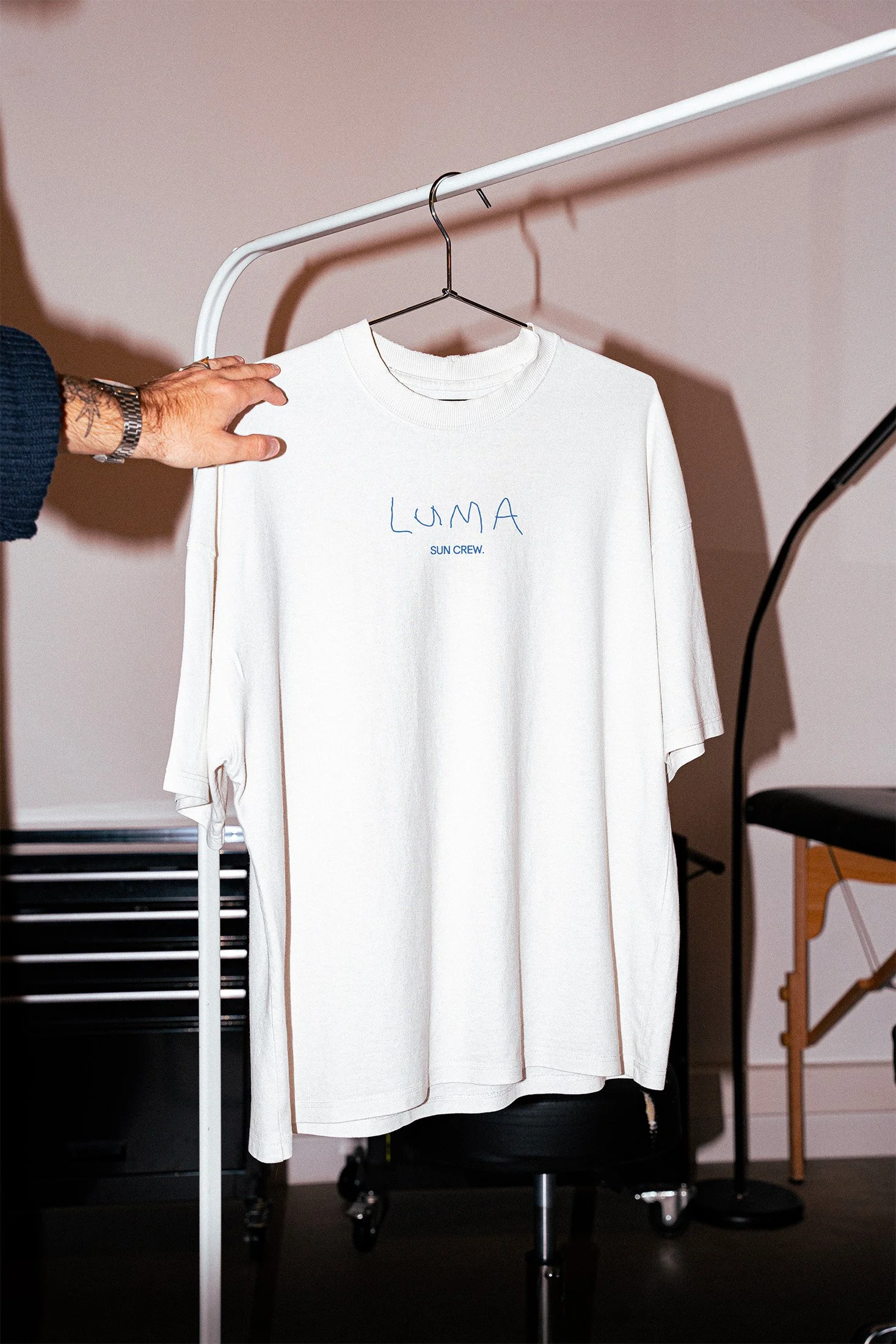
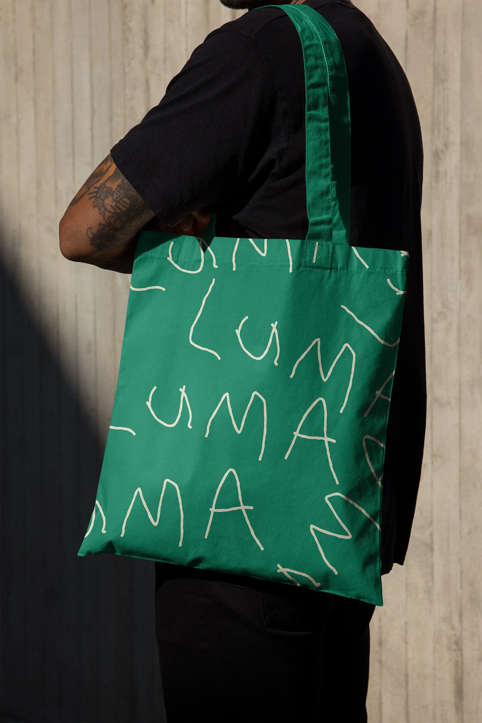
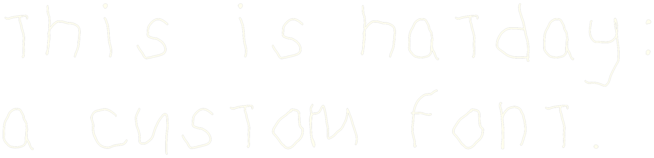
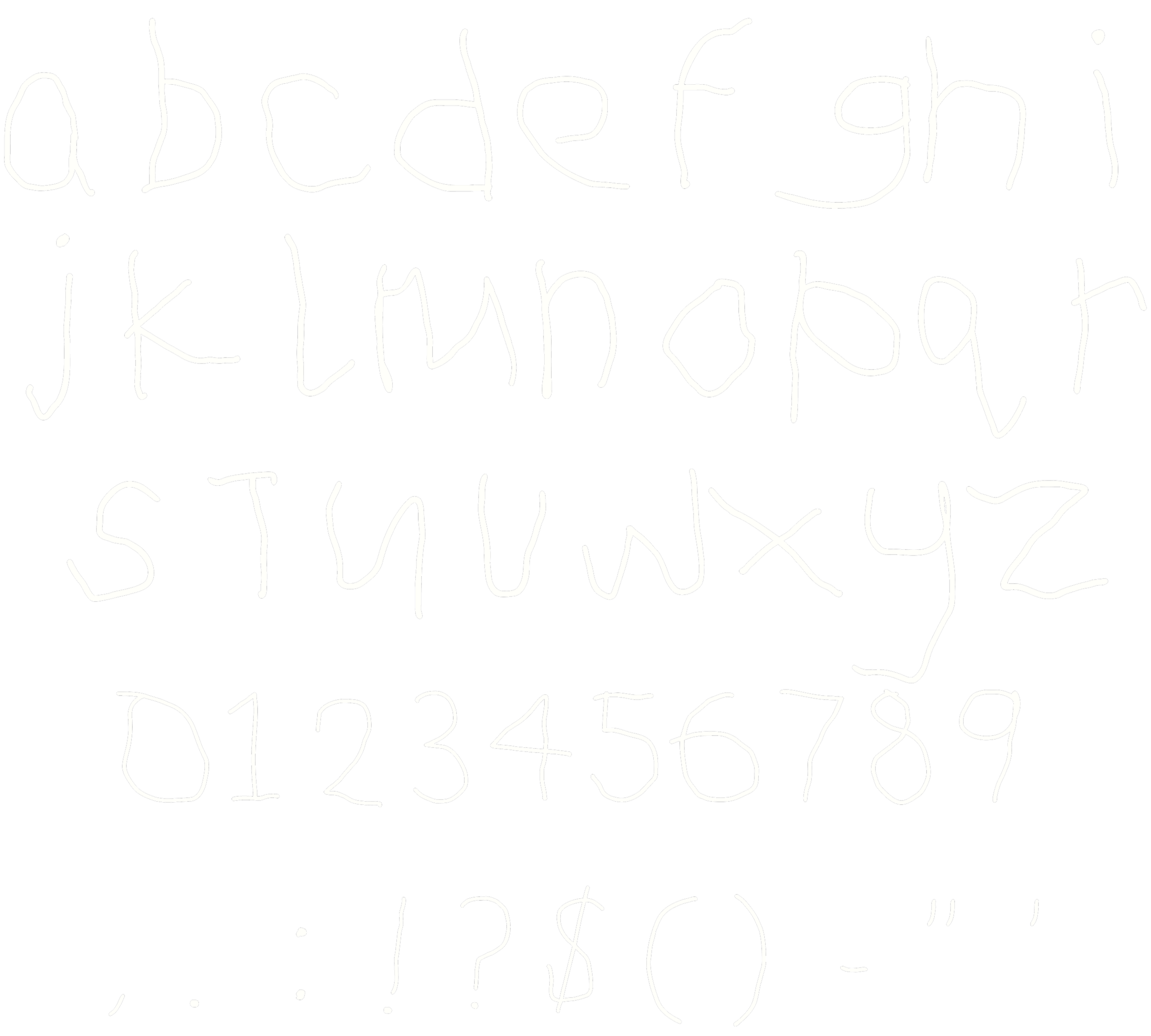
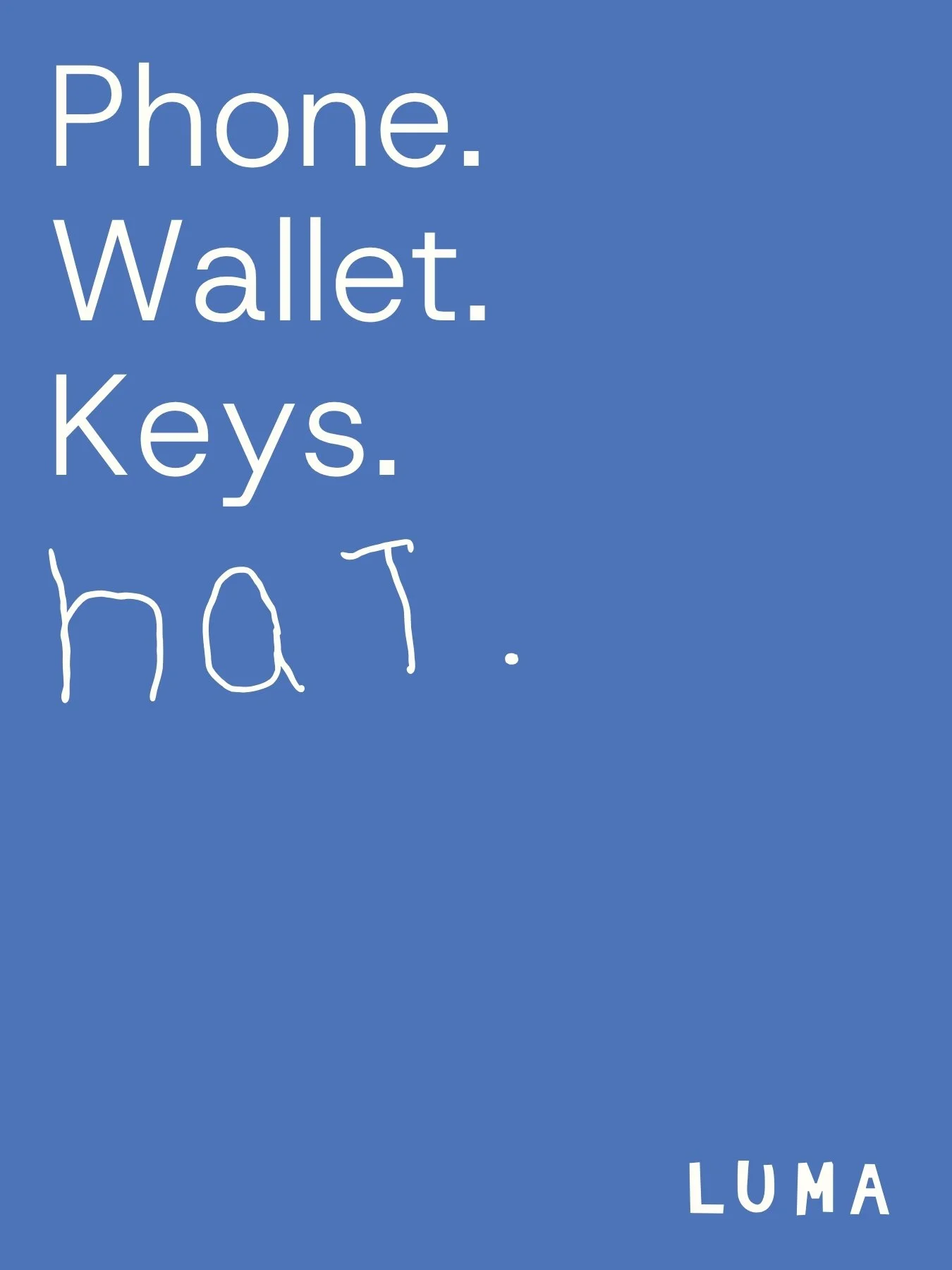
When Luma initially launched, the brand was heavily inspired by the founders’ kids (their kids are the reason they started the brand, and the brand name is made from their sons Luca + Max), and I wanted to find a way to bring this through to every aspect of the brand which resulted in a secondary logo written entirely by their son Max, as well as a custom font aptly named Hatday which I created from his hand writing.
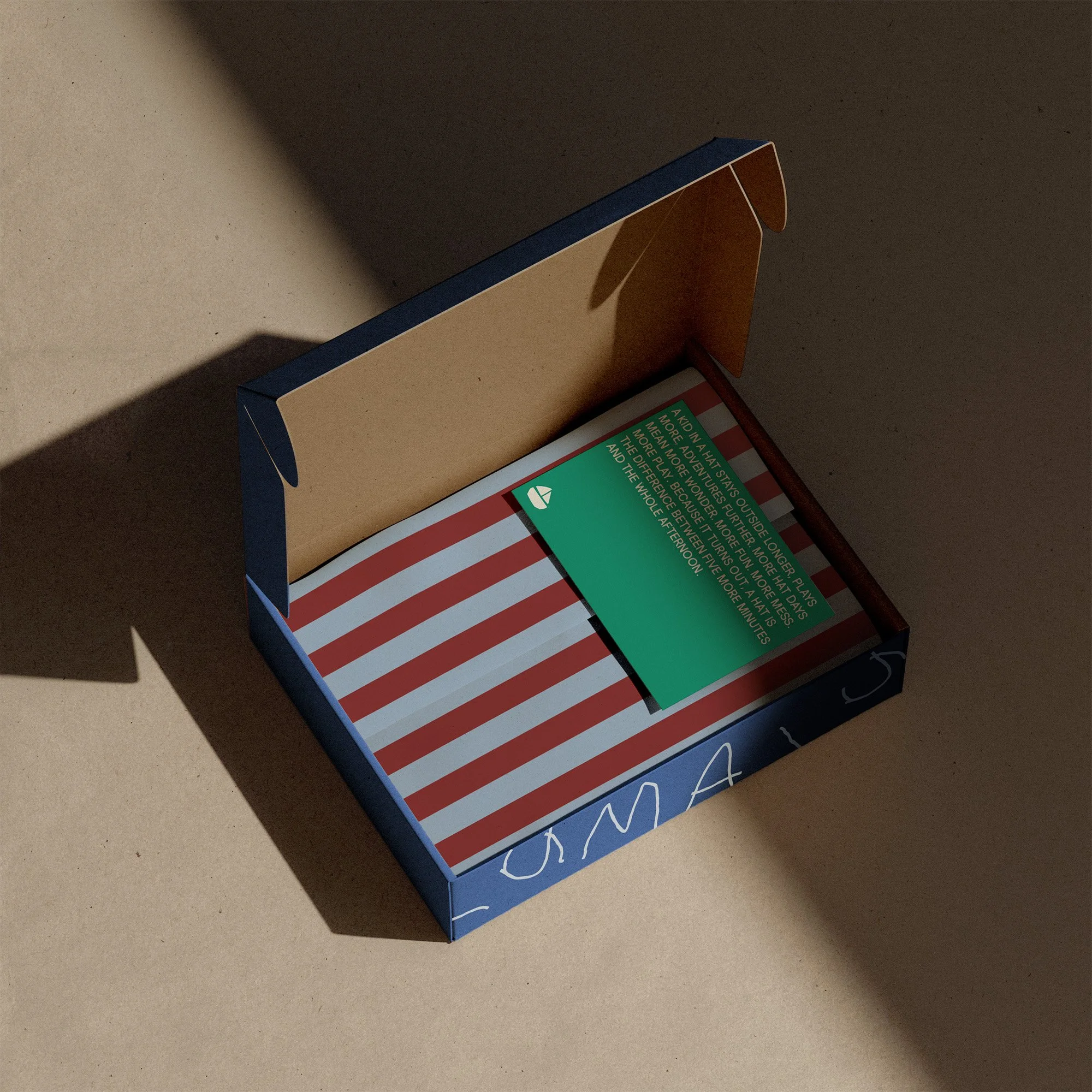
The rebrand resulted in a comprehensive design system that reflects everything Luma stands for with a perfect balance between fun, play, and joy, alongside sun safety and Luma’s sun safety expertise. The rebrand perfectly aligns with parents, carers, and those who shop for the little ones, and invites kids to feel like the brand can be part of their world too.
A TYPEFACE AND LOGO DESIGNED BY A 5 YEAR OLD:
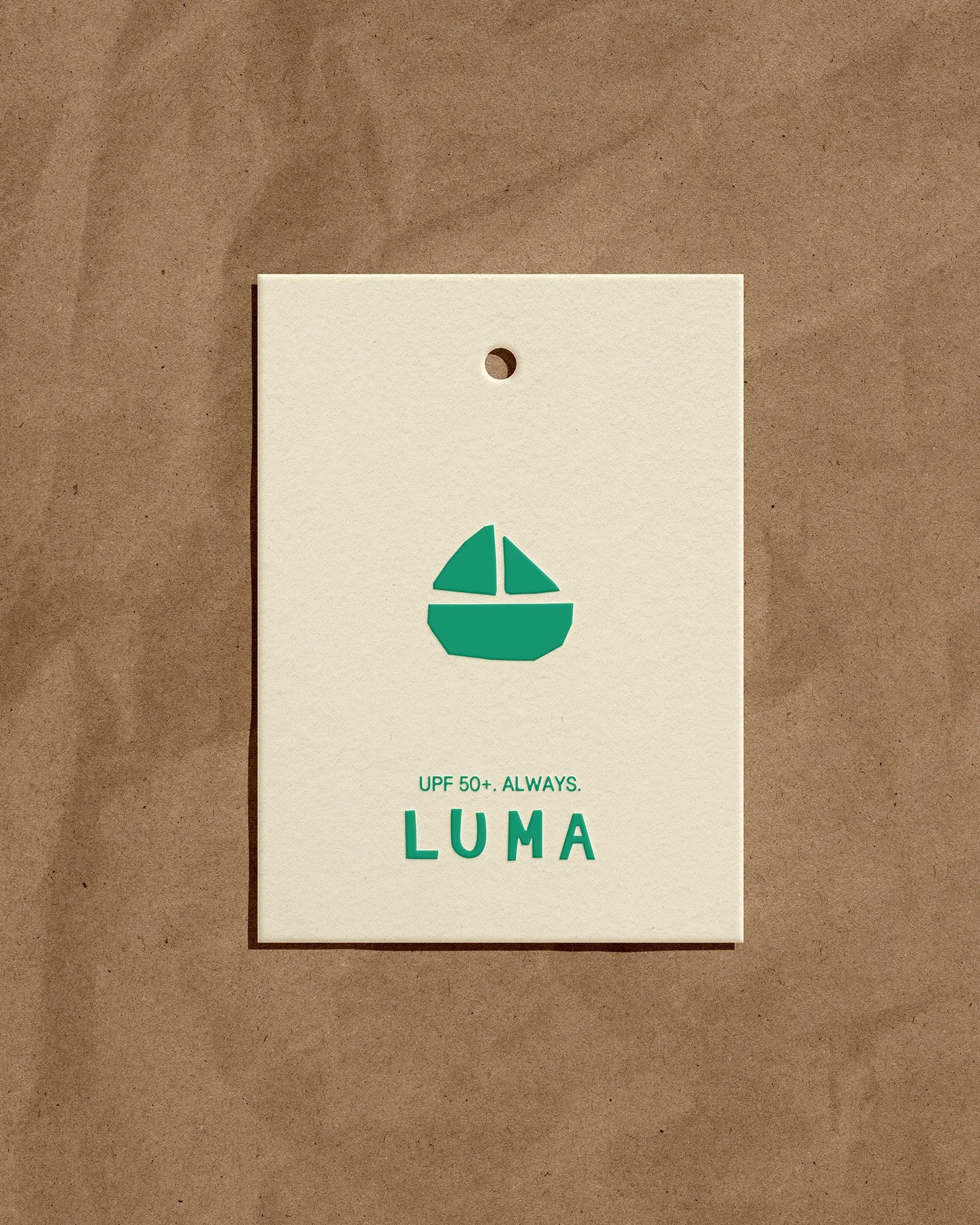
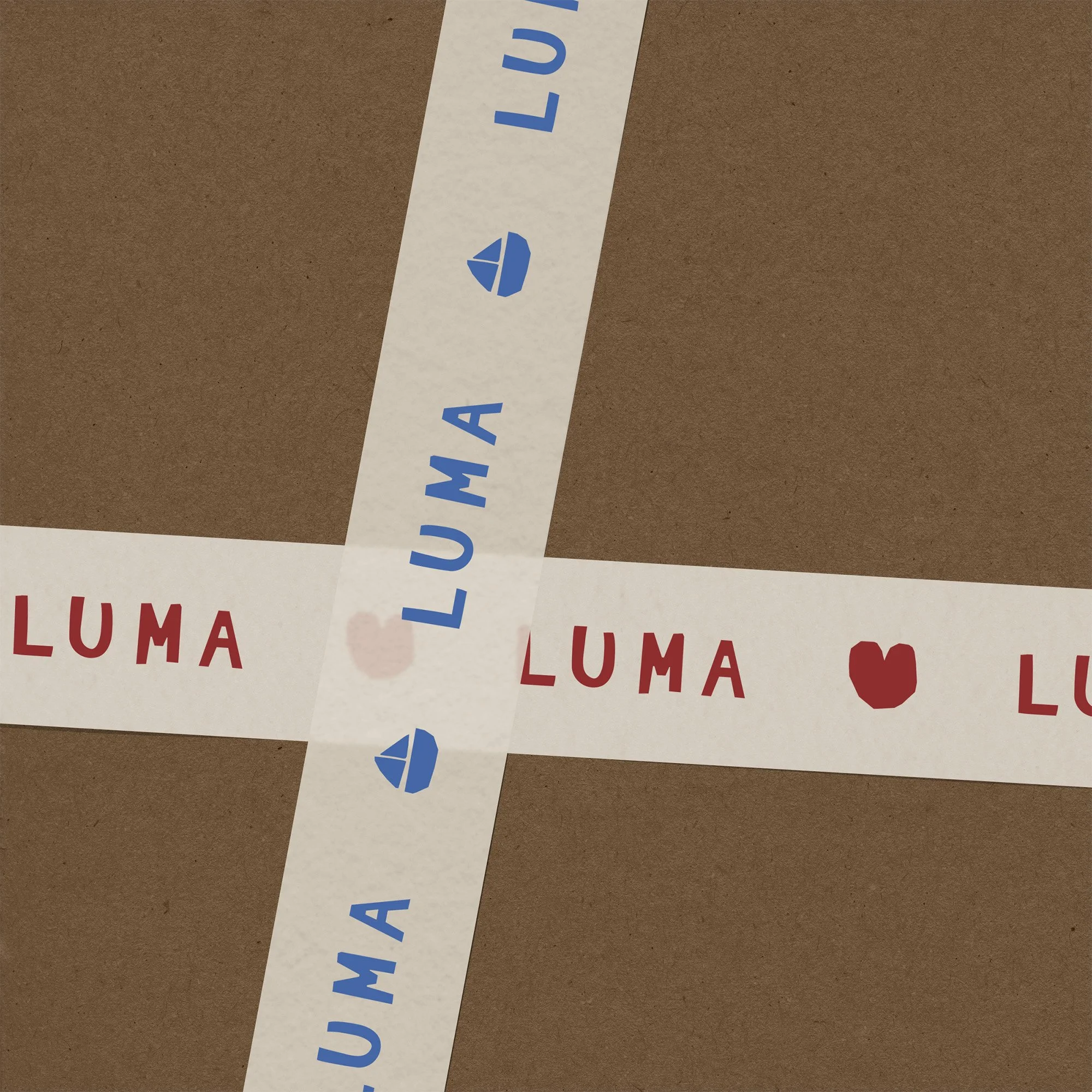
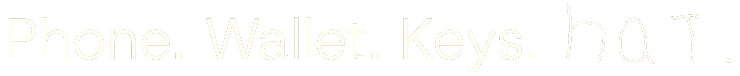
Hatday is a custom typeface built entirely from the handwriting of Max, the founder's son and one of the two boys the brand was named after. His hand writing also became the secondary logo mark. It's a detail that roots the identity in something no studio could ever manufacture: the hand of one of the kids who started it all.
AN ILLUSTRATION SUITE WHERE CURVES ARE NON-EXISTENT:
Another key challenge I had was to figure out how we can create a kids brand hat honours the feeling of fun and play, while keeping the brand feeling elevated and premium. It was a really fine line. One of the ways I achieved this was by creating an illustration suite that's made entirely with straight lines and pointy corners, without a curve in sight. This had a double meaning: Structuring the illustrations much like they are building blocks, a toy iconic to every kid's childhood, along with taking cues from Max's hand writing above, and the way young kids struggle to get their pen around a curve. This design choice has made a huge impact on the direction of the brand.
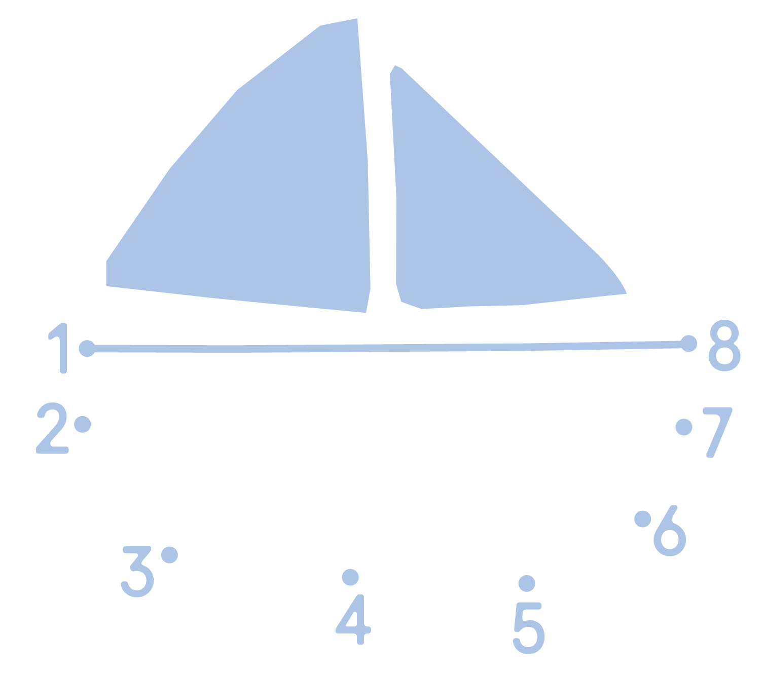
EXPANDING ON AN EXISTING IDEA:
I knew we had to take this ‘pointy edges’ idea and push it further throughout the brand, and one thing I really wanted to do is make the brand feel really interactive for kids, and invite moments of fun and play into the brand. Too many kids brands have logos that are way too hard for kids to draw, so I thought hey, what if we show them how to do it? And so Luma’s connect the dots were born. And in case you didn’t realise, connect the dots have pointy corners too. Bingo.


How is this Doing Good?
Although Luma has an amazing product, they have the most incredible reason they do what they do - to protect the sensitive young skin of kids from our harsh sun. This has the added bonus of making the parents and carers lives a little bit easier too. When kids keep their hats where they’re meant to be (on their heads), everything else gets a bit less stressful: you don’t have to fight the hat tantrums, or get back up every 5 minutes to put the hat back on.
Australia has some of the highest skin cancer rates in the world, so being a brand that educates kids around the importance of sun safety form such a young age, and makes this a bit of fun, is a brand that’s doing something that really makes a difference.