BALLET BLANC
CLIENT: Ballet Blanc
LOCATION: Sydney
CATEGORY: Doing things differently
SCOPE: Brand Identity, Site
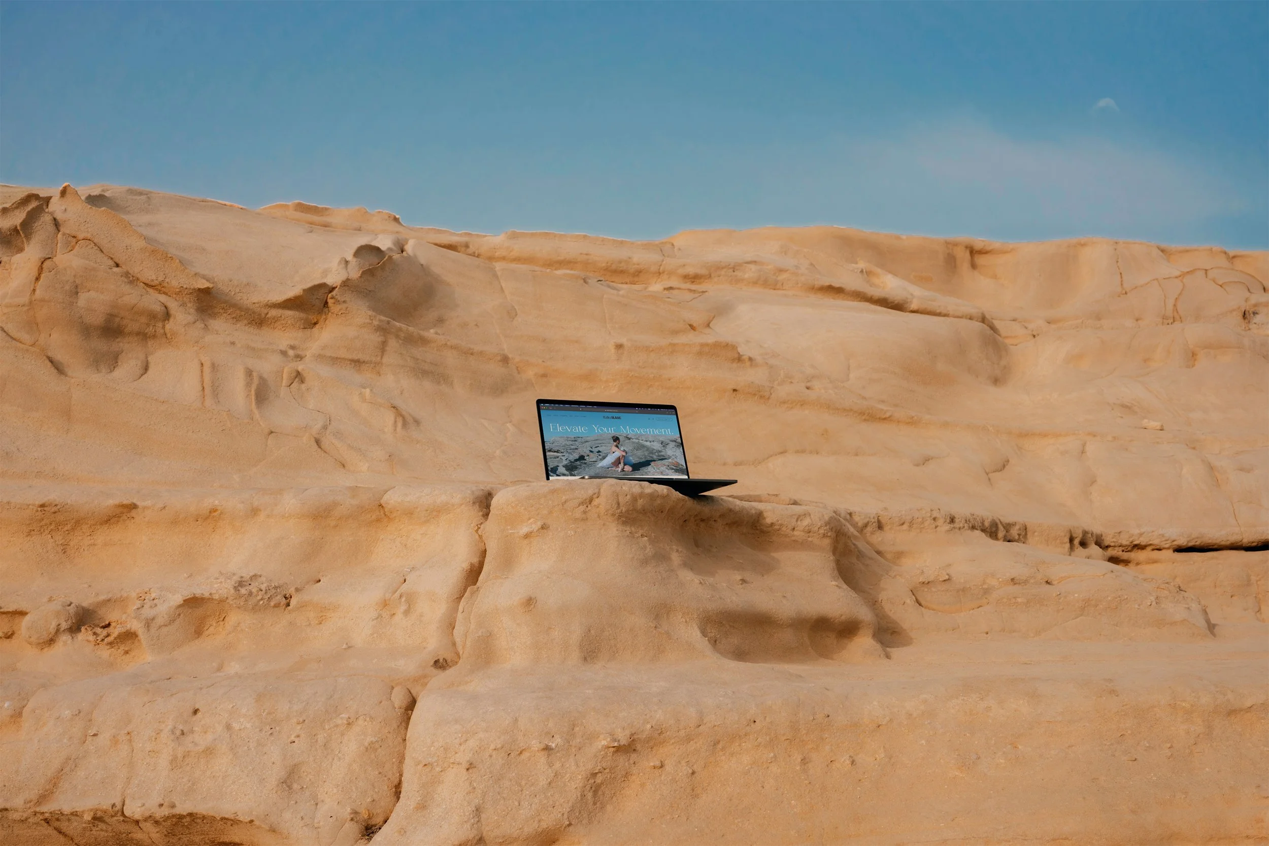
SITE: Ballet Blanc
Ballet Blanc is bringing you the Sutherland Shire’s newest youth program for the elite classical dancer.
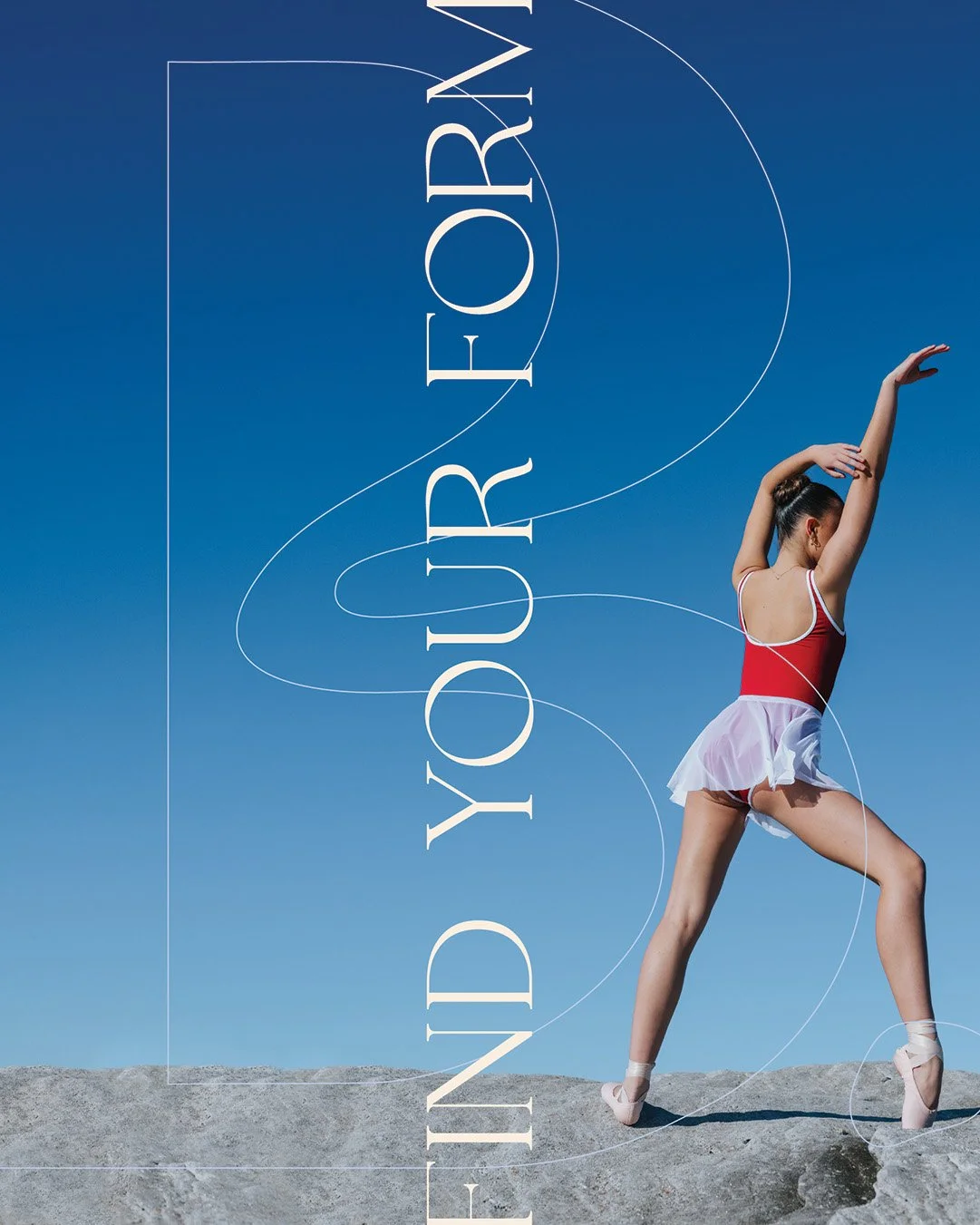
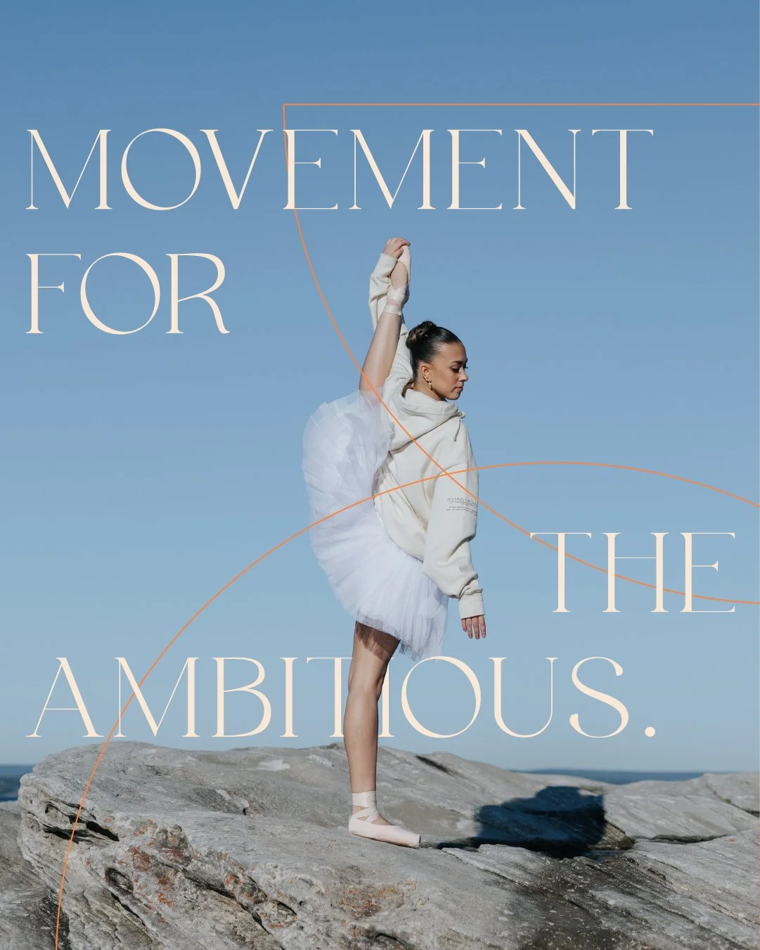
The brand is based on the concept of the Blanc Canvas, creating a space to allow dancers to tell their story, and hone their craft in an environment that gives dancers a taste into the world of professional ballet.
I worked with the team from BB to bring their brand world to life, and I’ve since also worked with BB on various production campaign identities.

How is this DOING THINGS DIFFERENTLY?
The world of classical dance is incredibly saturated, and more often than not always taking a very specific visual direction. Ballet Blanc wanted to flip that on its head, and honour their classical roots, but fuse this with a modern touch. If you look closely, this is the reason the logo uses a combination of sans serif and serif typography, to create a new take on the classical world of ballet.