I SCREAM, YOU SCREAM, WE ALL SCREAM FOR BRANDING
How understanding the world of ice cream, frozen yoghurt and gelato can help you build better brands.
When we talk about branding, everything tends to get lumped into one bucket. The conversation is almost always centred around the brand identity which is most often comprised of elements such as a logo, palette, typography, tone of voice, and the visual world - as if branding has one singular job.
But branding has a function. It always has a function.
And to build better brands, we need to better understand the environment the brand will exist in, so we can create an identity that’s perfectly suited to live there.
To understand the intricacies of this, you need to understand the world of ice cream.
So, welcome to my ice cream theory. Brands exist in one of two categories:
a) Brand-As-Product (the branding lives on the product),
OR
b) Brand-As-Communicator (the branding lives around the product/service)
There is a fundamental difference between the two, and a fundamental difference in the way a brand identity has to work when it lives on the product itself, compared to when it lives around the product.
And ice cream is the perfect way to explain this.
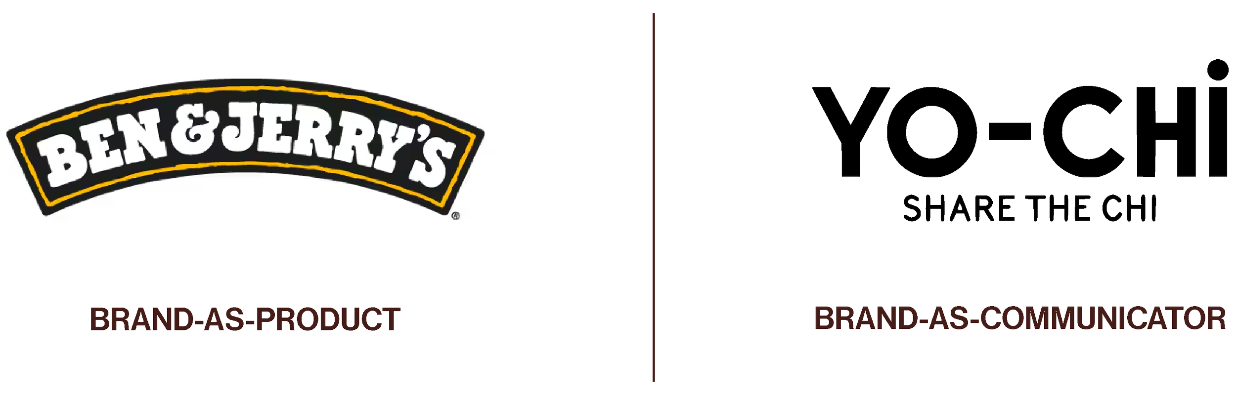
Brand-As-Product brands are when the branding lives on the thing itself. For example, Ben & Jerry’s. In this case, the brand lives on the ice cream tub. In the freezer aisle of Coles and Woolies. (Yes, I know Ben & Jerry’s also have physical stores, but for the purpose of my ice cream theory please give me some grace — their pints are their primary product after all).
Brands-As-Communicator brands are when the brand lives around the product, and communicates everything about it to the customer. For example, Yo-Chi. For anyone who has stepped foot inside a Yo-Chi store, you’ll know the brand lives on signage, on menus, on the cardboard cups, and on all collateral around their brick & mortar stores. The branding lives amongst the physical space and brand world and creates vibe and ritual of going to get frozen yoghurt.
Ben & Jerry’s sells ice cream through packaging. Yo-Chi sells ice cream through experience.
A very similar product, but the brand has to do a very different job for each, because the branding of one lives on the product, and the branding of the other lives around it.
So how can understanding this guide us to build better brands?
Knowing which of these categories your brand sits in should be one of the earliest questions you ask yourself. Knowing the answer will help guide your design decisions, because the environment your brand lives in determines exactly what your brand identity needs to do, and the function it has to perform, and therefore how it should be built.
The main function of Ben & Jerry’s branding has one job: to stop you in the freezer aisle, grab your attention before the latest low-cal-high-protein tub does, and make sure you can tell a Triple Caramel Chunk from a Non-Dairy Chocolate Chip Cookie Dough. Even on the days that you forgot to wear your glasses.
Yo-Chi’s branding has a totally different job. It’s less about trying to stop you in your tracks and more about making you want to hang around for a chat with your friends, even after you’ve demolished your $28 cup in a solid 3 minutes.
Colour
For Ben & Jerry’s, the brand lives on the product itself, which means the identity needs to be built for the thing, and where it will exist. This means we can make decisions around things like colours and fonts, based on the context that they need to work on the tub and differentiate flavours and product ranges. Because if the colour doesn’t work on the packaging, it’s not going to work for the brand.
But for Yo-Chi, their brand colours are a lot more simple. The more minimal, black and white branding sells, because the brand lives in the experience. Yo-Chi is living, breathing proof that you can have a black and white brand that sill feels totally fun, and colourful as hell. The brand doesn’t necessarily need so much colour, because the world around it fills those gaps. Don’t forget their physical spaces don’t actually have bucketloads of colour either they’re still kept fairly minimal with neutral tones and natural textures. Because the colour is quite literally in the yoghurt and the toppings, and the feeling of the rest of the space.
Complexity and Depth
A brand-as-product logo has to work in isolation. There is often no supporting environment (other than the shelf, POS, or a shelf talker), so it needs to communicate the entire brand personality, brand recognition, and differentiation on its own, and within a split second. Some may say these logos have to do a little more of the heavy lifting.
But a brand-as-communicator have an opportunity for the logo to be simpler, because it’s often never seen on its own. It almost always exists within a physical world surrounded by the very touchpoints that support the feeling for the brand. Just like Messina: a minimal yet personality-packed logo but the second you step through their doors you feel like you’re lining up for ice cream in a gallery.
Typography
Brand-as-product brands often need their typography to have personality, just as above. Because when the label/tube/box/vessel is where the customer sees the brand existing majority of the time, every element has to be doing its own job, especially for product, range, and brand differentiation on the shelf. (Or in the pantry, or in the bathroom cabinet).
However brand-as-communicator brands can often strip the typography back a little more. Because your typography might literally just be pointing people to the bathroom. Wayfinding is a function too, don’t forget.
The mistake most brands make is treating these two categories exactly the same, no matter which one their brand lands in.
That’s where the ice cream theory comes in and gives you all the guidance and answers you need. Understand the environment first, then everything should flow.
Next time you’ve got the Friday night munchies in the freezer aisle at Woolies, or waiting in line at Yo-Chi, have a look around. You’ll see exactly what I’m talking about.