COLOUR PSYCHOLOGY IS BULLSHIT
(AT LEAST until we have more research on it). Here’s why
Okay, hear me out. I'm not saying colour psychology is completely and totally bullshit, just like, sort of, mostly bullshit. Here’s Why:
WHAT IS COLOUR PSYCHOLOGY?
Colour psychology is the study of colour (or lack thereof) and how it affects human behaviour. If you give it a quick Google, you’ll find an infinite amount of examples similar to the below, yet very little content actually questioning its truth.
There is no doubt the first thing you will see, are a bunch of articles that look similar to the below, claiming that blue means X, green means Y, and yellow means Z. But I call bullshit.

A MARKETER’S DREAM
Look, I get it. I understand why designers, marketers, and anyone who works with brands loves colour psychology. It’s an easy win, there’s no doubt about it. Imagine pitching a colour palette to a client with the reasoning “We selected blue as it’s known in colour psychology to give the audience a sense of trust. And then we paired it with orange because orange has been proven to create confidence. This is all backed up by research and science.” It’s almost impossible for a client to argue with.
Although these ‘findings’ might sound super impressive in front of a client, they are simply poetic meanings at best.
Of course, there is no doubt that colour affects us as humans. Have you ever tried switching your phone to black and white mode? It is BORING and I last a total of about 1.27 minutes before I change it back to colour.
It makes sense that throughout evolution, we would act differently around red, hot fire, and a little more relaxed under a blue sky with the sun shining. But we’re not cavemen anymore, and colour exists in a completely different context in the modern world.
Throughout my work, I truly love being able to reference scientific findings wherever possible, so when I decided to dive deep into researching colour psychology, I was genuinely hoping that I would find a study or two that had multiple findings to back up some of these claims that get thrown around left right and centre. Unfortunately, this was not the case.
1: THE SCIENCE DOES NOT EXIST
The problem with everyone relying so heavily on colour psychology, is the science simply does not exist yet.
There hasn’t actually been enough research into it for us to rely on it so heavily — and I mean ACTUAL research. I hate to break it to you, but random marketing website or blog posts really don’t cut it as credible sources.
However I was able to find one study: Andrew J. Elliot, a Professor of Psychology at the University of Rochester did a 2015 study that unpacked a lot of this. He basically found that the science really just isn’t there yet.
“It is premature to offer any bold theoretical statements, definitive empirical pronouncements, or impassioned calls for application; rather, it is best to be patient and to humbly acknowledge that color psychology is a uniquely complex area of inquiry that is only beginning to come into its own.
Findings from color research can be provocative and media friendly, and the public (and the field as well) can be tempted to reach conclusions before the science is fully in place. There is considerable promise in research on color and psychological functioning, but considerably more theoretical and empirical work needs to be done before the full extent of this promise can be discerned and, hopefully, fulfilled.”
Source: Elliot AJ. Color and psychological functioning: a review of theoretical and empirical work. April 2015. PMID: 25883578
TL;DR: It seems promising, but we don’t know enough about it yet.
2: NOT ALL HUES ARE EQUAL
It is remiss to say for example that “yellow means x” or “red means x”, because there are thousands of shades of yellow, and thousands of shades of red, and not all of these shades of one hue are going to feel the same. A deep, muddy mustard shade of yellow is going to look very different to a bright neon yellow. And both will create a different feeling.
For the sake of this example, I’m going to use the colour blue: a colour that is known widely throughout the creative world as being the one single colour that evokes ‘trust’. But after looking at these two shades of blue below, you can’t possibly tell me that they both really, truly, make you feel the same way.

I hate to be the bearer of bad news, but if you want your brand to feel trustworthy, you need to do a hell of a lot more than just use the colour blue. And by this logic, this would also mean that you absolutely must include the colour blue in your palette for your brand to feel trustworthy. Yikes.
Facebook is blue, but does anyone really trust that Zuck guy? Just sayin’.
Let’s do a quick exercise: Think about a brand you love. Got it? By default, the brand that came to mind is probably also a brand that you trust, so pause for a second and think about why you trust them. Now, I’m gonna guess that what came to mind was something along the lines of: great customer service, great customer experience, and a consistently reliable product/service. I am also going to guess that this trust has been built around them because of your experiences with the brand — not because of whether or not they have blue in their branding.
In March 2024, new research came out about the 10 least and 10 most trusted brands in Australia. Do you want to know the colours of the most trusted brand in Australia? Green, red, and white. Yep. It’s Bunnings. And do you want to know what colour doesn’t exist in their branding? Blue.
And the least trusted brand in Australia is Optus (a surprise to no one) yet with a core brand colour that is eerily close to blue. Something really isn’t adding up here.
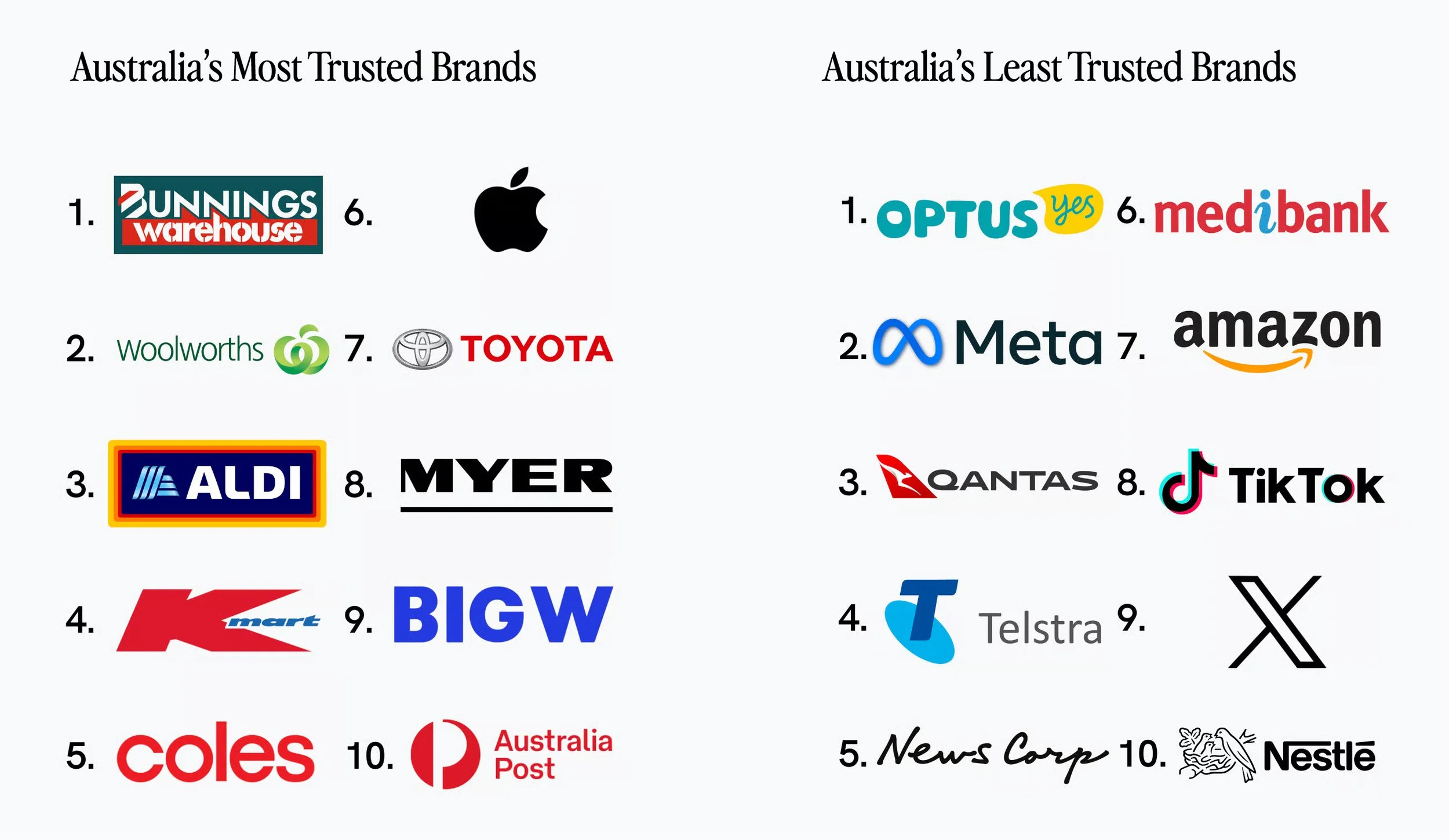
Source: Woolworths is no longer the most trusted brand in Australia, The Daily Aus 2024.
3: BAKER-MILLER PINK
A very specific shade of pink called Baker-Miller Pink became famous for being painted on the walls of jail cells in the 80s. Alexander Schauss, the man behind it all, through his research found that this particular shade of pink could temporarily reduce hostile or aggressive behavour, after painting it inside jails.
I had to see how credible this study was, and after going down a rabbit hole, I found that the experiment has since been recreated twice — once by Schuss himself, and again by psychologist Oliver Genschow 30 years later. Long story short, both of the follow-up studies were a flop, and both times confirmed that Baker-Miller pink didn’t actually reduce aggressiveness at all.
Are we really shocked?

4: DON’T FORGET ABOUT THE CONTEXT OF COLOUR
Personal perception is a huge part of this conversation that is forgotten way too often. Personal experiences, religion, cultural background, our heritage, gender identity, where we’ve come from, and events in our lives can all influence how we naturally react to particular colours.
In Western culture, red is often used as a colour to signify danger or emergency, but in China, it’s a colour of luck, happiness and celebration.
Or, if you were in a car crash with a blue car, then there is a good chance that subjectively you will be triggered by the colour blue.
Language also plays a huge part here, and Japan is a great example of this. The Japanese language used to have only four colours: Blue, Red, Black, and White. The word ‘Blue’ would refer to shades that we know today as green and blue — which is a big reason why you’ll find that some traffic lights in Japan actually use the colour blue, where in Western society we would normally use green. Linguistically, this is known as ‘grue’. Japanese is not the only language that combines these two colours. This has also been studied through Arabic, and Berinmo of Papua New Guinea. There is a great video on this here by linguist Adam Aleksic.
Essentially, the colours that we actually see, are heavily influenced by the words for colours that exist in our natively spoken language. Crazy, right?
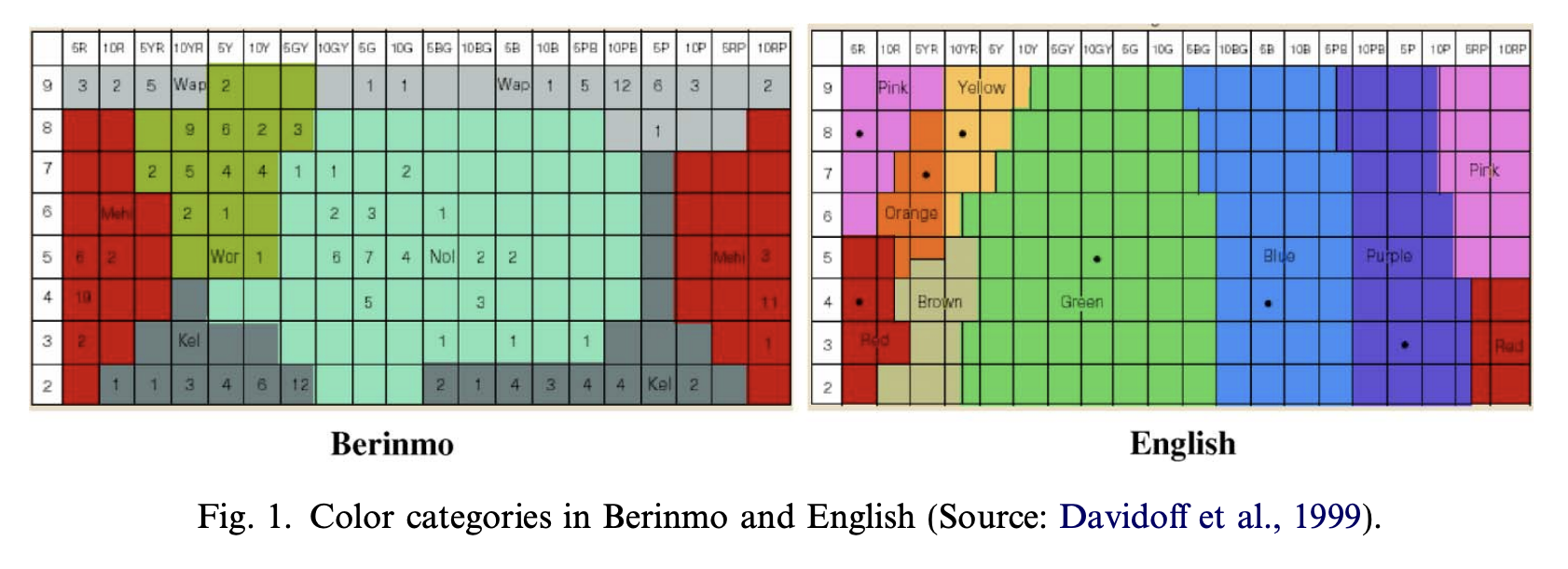
Colour perception in the Berinmo language, compared to English.
And when it comes to branding, colour is just one part of the puzzle. Without typography, copywriting, shapes, layout styles, photography, art direction, and everything else — colour can create a totally different feeling. It’s these elements that all make up the bigger picture, to pull on our heart strings and create an emotional reaction.
5: IT’S NOT AN ACCESSIBLE APPROACH TO DESIGN
So if we are relying on colour to give our brands meaning, what about people with vision impairment? What about people with colour blindness?
That blue that you specifically chose just because you want your brand to appear trustworthy, isn’t going to be perceived as that same shade of blue by all of us.
This approach is putting too much responsibility on colour alone, to tell an entire brand story.
6: IT’S CONTRADICTIVE
In Western culture, I’m sure a lot of us will associate the colour red with passion and love, but we also associate red with warning and emergency. And what about fast food, or holidays like Christmas? But how can red mean both ‘danger’ and ‘love’ at the same time?
The problem with this approach to colour psychology is that it’s claiming that one colour can single-handedly communicate multiple opposing meanings simultaneously. But this really doesn’t add up.
So, instead, look at the energy of the colour — is it a muted and soft red, or is it an electric red that’s going to grab attention? What other elements is it paired with? What other colours are in the palette?

7: COLOUR PSYCHOLOGY DOESN’T HELP US PUSH THE BOUNDARIES
If we follow the ‘rules’ of colour psychology, then for a skincare brand using natural ingredients we should be choosing greens, because by the laws of colour psychology, green = natural.
Although green might tell a story of ‘nature’, almost every brand out there uses the colour green to communicate their sustainability / natural / from-the-earth message.
So if you're trying to stand out in an already saturated market, is green really going to be the best choice for this?

I don’t know about you, but I see this as an opportunity to redefine the ‘meaning’ of particular colours. Now THAT’S exciting.
SO, WHAT’S THE SOLUTION?
Focus more on how your palette works as a whole — and the identity as a whole — rather than selecting particular colours because of a ‘meaning' the online world claims colours have.
When we look at the identity as a whole, pieces of the puzzle like copywriting, photography, and art direction are just as important as the logo and colour palette, but are too often overlooked.
Until we’ve got more research and science in this area, I'd take colour psychology with a grain of salt. Or maybe like the whole entire amount of salt in the Pacific Ocean.
And like they always say, don’t believe everything you see online.
AFTER ALL, DESIGN RULES ARE MADE TO BE BROKEN.
Who said we even need rules about colour in the first place? And honestly, if you ask me, this world could do with a whole lot more of it. 🌈
When colour psychology has been properly researched, then we’ll talk.